Lead Generation

Our Mission

Our mission is to help local businesses in the South West and South Wales grow by providing exceptional online and offline marketing solutions that connect local businesses with local customers in the communities they serve. We’ve been doing this for over 40 years now and we’re pretty good at it.

*

Lessons Learnt

Like many of our 2500 customers, we are a small family business. It is this unique insight that has allowed us to evolve and fine tune our lead generating products to meet the needs and demands of our customers and based on the following:

– Local matters.

– Local is a powerful advertising tool

– Service providers want to work locally to reduce their travelling time and costs.

– Most customers prefer local suppliers and services.

– Marketing and lead generation is more complex in a digital age.

– Many smaller business owners need a reliable marketing partner with specialist knowledge and capabilities.

*

This is how we do it

*

Little Blue Book

*
little-blue-book

*

Still highly relevant in the 24 areas we service.

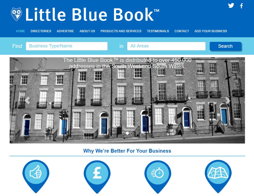
Delivered by Royal Mail to over 500,000 homes and businesses

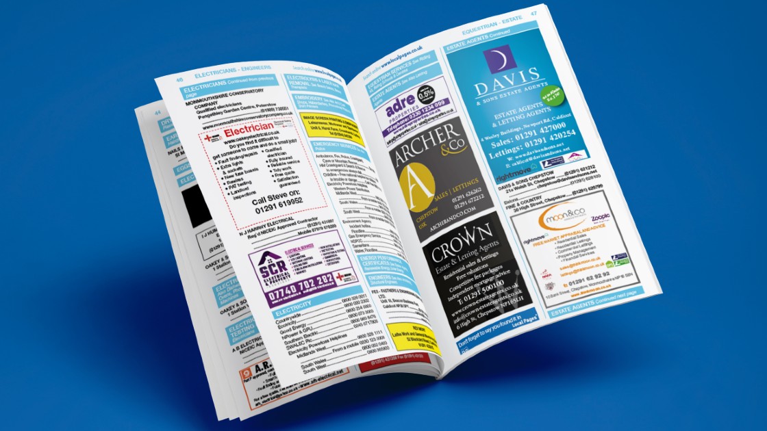
It contains:

  • Classified adverts under directory headings
  • Local maps and street guide
  • Other useful information

Exceptional return on investment

Updated every 12 months

*

LocalPages.co.uk

*

*

  • Serves the same areas as our Little Blue Book
  • Over 15,000 searches made each month for local businesses
  • Mobile friendly
  • Very cost effective especially for small businesses
  • Free listings available by clicking here
  • Updated immediately

Get a free listing by clicking here

*

Digital Marketing

*


Includes:

  • Website design
  • Search engine optimisation
  • Online advertising
  • Social media
  • e-Commerce
  • Content
  • Strategy

*

Print Services

*

menu-web

*

Includes:

  • Logos
  • Branding
  • Business stationery
  • Flyers
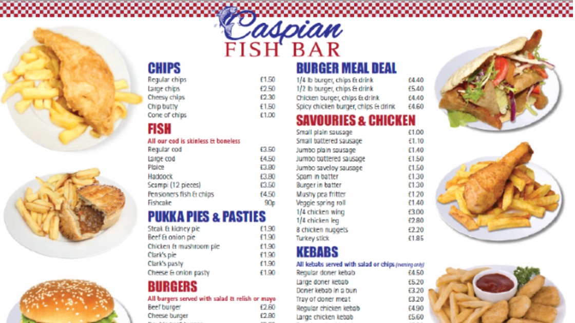
  • Menus
  • Brochures
  • Posters

*

Find out more regarding how Local Pages can drive more customers to your business. Call 0117 923 1122 today, email sales@localpages.co.uk or book an appointment with the Local Pages Team below. 

*

*

*

download

Share Button
Leave a comment on Lead GenerationCategories Advertising, Blog, Help & Advice, Marketing, Sales, Small businesses, Websites

Fork ‘n’ Ale Beer Game

We build games

One thing you may not know about Local Pages is that we have a game designer in our studio.

So, when Fork ‘n’ Ale wanted a fun way to encourage more customers to visit their website and increase the amount of time that they stayed there… what better way to meet the brief than to create an addictive game for customers to play.

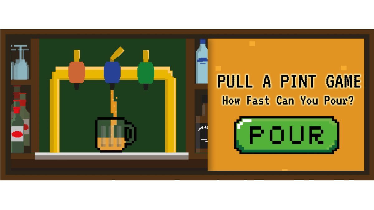
The game is simple. By pressing the space bar on your computer or the ‘pour’ button on your mobile phone you fill a glass with beer. Once the glass is full, your time is recorded and you can leave your initials on the leader board.

At the end of each month there is a prize for the top score .

*

So why is this particular game such a good marketing tool?

1 – You have to engage with Fork ‘n’ Ale’s website – the game is at the bottom of the home page exposing players to all Fork ‘n’ Ales’s marketing, including special offers and menu.

2 – The game is easy and quick to play – ideal for groups to play in a pub on a mobile phone. E.g. the one with the lowest time buys the next round.

3- To enter your score on the leader board you have to leave an email address – ideal for data capture and future marketing activities.

4 – Winners are announced on their Facebook page –  encouraging players to interact with Fork ‘n’ Ale on their social media platform.

*

It ticks lots of boxes!

*

Play the game by clicking the box below.

forknale-beer

Get a game to encourage more visitors to your website

*

Call the LP Digital team today on 0117 923 1122 or book an appointment below for a call back.

*

*

*

download

Share Button
Leave a comment on Fork ‘n’ Ale Beer GameCategories Blog, Branding, Creative, Design, Marketing, Small businesses, Social media, Websites

20 Top Tips for Creating Engaging & Informative Content

Everyone in business knows that we should be engaging with our customers on a daily basis with rich, informative content. It sounds great until you actually sit down, switch on your computer… and then stare at it for an hour because you don’t know where to start.

So to help get your creative juices going, here are our top 20 ways of engaging with your customers online.

1 – Infographics – Create some visual representations of ideas and information found on your website. Infographics are so much more interesting (and often more informative) than large passages of text.

2 – Memes – Those little videos and images with witty comments are often the messages that go viral.

3 – Videos – Create videos (short & sweet) giving information regarding your products and services. Don’t worry about how you sound or look like, non-professionally produced videos appear much more authentic.

4 – Product Reviews – Got a new product? Put together a product review to allow customers an insight into what you really think.

5 – User Generated Content – Get customers to produce content for you. Share stories and content from third party websites you find interesting or promote good practice.

6 – How to Guides – Put together a range of helpful guides aimed at people that use your products and services.

7 – Lists – People love lists and they improve talkability. Even a list like this one!

8 – Photo Galleries – A picture paints a thousand words. Create galleries of products and theme them to make them more interesting.

9 – Case Studies – Use these to show the breadth and depth of what you have to offer your customers and underline how great you are. Make sure they’re up-to-date and are heavy on pictures and light on text.

10 – Client Testimonials – Testimonials build trust and loyalty. So when a customer says what you did was great, ask for it in writing. Better still, ask if you can film them saying it.

11 – Newsletters – Keep in touch with your email subscribers with a monthly update featuring new products and the highlights of any articles, blogs, videos and social media posts you’ve put out that month.

12 – GIFS – Use clips from videos embedded with text to demonstrate a point.

13 – Events – Create online events like Zoom webinars to engage with your customers , record them and share with others that couldn’t attend.

14 – Images – Use, wherever possible, original images to demonstrate and reinforce written messages.

15 – Podcasts – To convey ideas that don’t necessarily require visuals, put together some podcasts on various themes that may interest your customers.

16 – Slideshares – Get innovative with Powerpoint or Keynote and create decks of slides to inform and engage with your customers and share them online.

17 – Blog Posts – If no one was interested in opinions, they wouldn’t buy newspapers. Get your thoughts down in order and publish them. Try to ensure they are not time sensitive and can be read anytime.

18 – Newsjacking – Take a news story and use it to create content that will attract positive exposure for your brand.

19 – Press Releases – Directly target the media with industry news that may be of interest to their readers.

20 – Polls – Create polls to get your customers voting and seek out their preferences and their dislikes.


If you need help with any of the above, contact the Local Pages team on 0117 923 1122 or drop us a line at info@localpages.co.uk

Share Button
Leave a comment on 20 Top Tips for Creating Engaging & Informative ContentCategories Blog, Branding, Creative, Design, Help & Advice, Marketing, Small businesses, Social media, Websites

Content Creation: The key to your websites’ success

Every decent website revolves around the same thing: content. A Unique, relevant and up-to date content is highly influential in how successful a website and marketing campaign performs. However, many find that content creation is very challenging and it is one of the most common issues in a business. Often this is due to a lack of time or resources, or simply that people don’t know where to start.

content creation Marketing Website Statistics


In order to create content and use it for marketing purposes, a business needs to consider how the content will be shared on their website and various online marketing platforms. It is also important to consider the frequency of content and who the intended audience is. There is a wide range of options for online marketing, such as social media, email marketing, website content and blogs. There is plenty for a business to choose from!

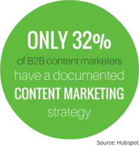
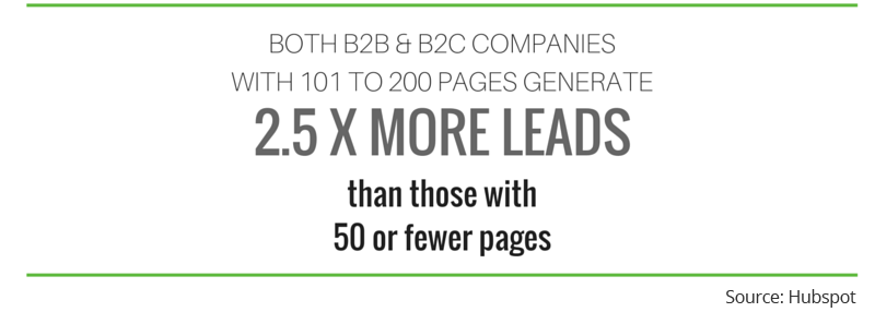
Many studies have been conducted into the effectiveness of having a content strategy. These studies have found that higher levels of content on a site can have an impact on the business’ marketing strategy and overall search engine ranking. These are just some of the benefits of having a steady stream of fresh, targeted content:

  • Increase levels of traffic to a website
  • Increase amount of enquiries/ leads received via website
  • Build up followers on social media
  • Enhance brand awareness
  • Become trusted within your industry by writing content to showcase abilities and knowledge


content creation Marketing Website B2B Leads


Sounds great! But how do you create content?

Content creation doesn’t have to be a daunting task. Every business has something to talk about, whether it’s a new product or service, an upcoming event, or an opinion on a recent industry related story. Not forgetting the most important (and easiest!) source of unique content; customers!

Creating stories around customers and the services/products they have received is the easiest form of content to write. Start by asking the customers for their feedback. The comments that they provide can be used to as the focus point of your content, and this can be shared throughout all of your marketing activities. After all, word of mouth and referrals are the greatest sales tool!

Our top tip for new content creation is to include as many targeted keywords and phrases as possible. This will help towards search engine rankings and help sites such as Google to understand what the content is about. But remember to keep it natural and don’t stuff keywords in randomly. This could be seen negatively by Google and other search bots.

Once you’ve got some content and keep going! Set yourself a target and allocate some time for putting together more. Try to keep to a regular schedule, even if it’s just a blog post every month. It all helps!


Share Button
Leave a comment on Content Creation: The key to your websites’ successCategories Blog, Marketing, WebsitesTags , , , , , ,

25 Years of World Wide Web

Who remembers 1989? Hands up. Yep – most of us here at Local Pages too! Whilst we were busy perming our hair and rocking out to Rick Astley, a very clever guy called Sir Tim Berners-Lee was creating the World Wide Web in Switzerland. It was a new way to distribute information on the Internet. We’re not sure about you but how often do you stop and think about how the World Wide Web actually works? It just does, right? Well here’s the science behind it.


The Web is based on hypertext which allows the user to connect from one document to another at different sites on the Internet via hyperlinks. And for the first time in 1989, the Web was accessible to use through graphical icons. Some of the early adopters of this new technology were Apple, Yahoo, The Telegraph and The White House to name but a few. Those first sites seem so basic to us now.


The Telegraph Webpage World Wide Web


At Local Pages life continued without www. until the millennium when our first site was designed. As you can imagine, it was a simple site that allowed us to show information about who we are, what we do and how to contact us. Since then, we’ve had two major re-designs. And our website is a lot more involved. You can access price lists, online copies of directories, our search site, as well as this blog!


It’s not just our appearance, but the way we think about websites has changed too. For any size of business, your website is your “shop window” – your chance to invite people in, stay a while, and invite them to (hopefully) buy something. And businesses spend time and money making sure that people see that shop-window through social media, SEO and blogs. A website that isn’t attractive, or doesn’t rotate it’s “window-stock” regularly can quickly become a redundant or even negative attribute for a business. It’s the age-old saying of “first impressions count” and a customer with plenty of distractions can easily have their heads turned in a different direction.


We would love to hear from you – leave us a comment below telling us about how your website has changed over the years. Did you know we can help with all aspects of website design? We offer anything from a free review, to a re-design or brand new site development.

www.localpages.co.uk World Wide Web

Share Button
Leave a comment on 25 Years of World Wide WebCategories Blog, WebsitesTags , , ,

10 Tips For A Better Website

As a Front-end Web Developer at Walpole Digital Media, I am involved with a variety of aspects of projects, from the initial client meet and requirements gathering, producing designs, bringing them to life and turning them into a website.


Although each project is different, I’ve learned that there are several universal tips that can be applied whatever the challenge. Below I share my top 10.


  1. Avoid carousel image sliders

They may look like a showcase piece, but there aren’t any studies that suggest that sliders are a good idea. When designing a website, I always insist that we avoid using a slider and point people to http://shouldiuseacarousel.com/ when wanting to explain why we should not use a slider.


And here’s why:


  1. Use images

So what should you fill the carousel-void white space with? A relevant and professional image that fits the style and theme of your website will be much more effective. This gives your user a single focal point. It doesn’t need to be boring either; a good web developer will know great ways to display imagery, just have a look at enrola. There’s a lot of focus on images, and we can see some images move and fade into position, some are fixed and as you scroll you see different parts of the image and some are static.


  1. Care for content

In the initial stages of a project, I usually insist that we design content first – this simply means that the client provides all the website content before we design. Although the content may change over time, it gives the designer a good idea as how to best structure the content, how headings will be used and displayed and the overall design in general. It may seem like a small thing, but it goes a long way in helping the designer get a feel of the visuals.


  1. Keep it simple

In 2011, well renowned usability expert Jakob Nielsen published an article about how long users stay on web pages. He says users won’t stay on your website for very long, often leaving within 10-20 seconds, but pages with a clear value proposition can hold people’s attention for much longer.


Your website visitors are on your website for a reason, you don’t want to make them work too hard to find what they’re looking for. Your website design should be simple and not overly complicated; if it’s too difficult to understand then your users will lose interest and move on. Aside from design, you should keep your navigation and page structure simple. Users want to find what they are looking for in as few clicks and page loads as possible.


  1. Use white space

On more than one occasion I’ve had clients say to me that there is too much white space in my design and the space needs to be reduced so the screen is filled with more content.


I understand it’s important to get the user’s’ attention straight away, and you want to show them as much as possible above the fold. However, white space is essential to good design. It makes your content more legible and gives it breathing space. When content and parts of your website are too close together, the user is more likely to lose focus.


  1. Use attractive Calls to Actions

Most websites will have a Call to Action (CTA), whether it’s getting your visitors to read an article, sign up or even to contact you.


There are some things to consider when designing your CTA, such as:

  • Design – it should look attractive, eye catching and enticing.
  • Wording – short and concise with the correct possessive determiners. Studies have shown the use of ‘my’ in a CTA is far better than using ‘your’.
  • Colour – the button should stand out from the rest of the page and recognised as a clickable button. There isn’t a specific colour that you should go with, as long as the rules above apply.
  • Size – make the button too small and it won’t be visible, make it too big and it looks like you’re trying too hard. A bigger button isn’t automatically better, so be sure to find the right balance.
  • And positioning – usually CTAs will be placed above the fold, which is great! But it really depends on what you are trying to sell. If you have a complex product, having a CTA at the top may not help as users will not know what it is until they scroll down to read about it, resulting in the CTA being placed afterwards the more logical option.


  1. Make sure your website is mobile friendly

With the virtual world easily accessible from the palms of our hands, it’s essential that your website is mobile and tablet friendly, also known as ‘responsive’ in web terms. You will often realise that the layout of the website changes when you view a website from your laptop and come back to it later on your mobile or tablet – this means the website is mobile and tablet friendly.


Furthermore, Google disapprove and discredit your website in their ranking system if your website is not friendly for devices other than desktop or laptops. If you want to get onto the first page of Google, then this is good start. After all, who doesn’t like being on the first page?


  1. Keep your website consistent

Keeping your design consistent is about being professional. Inconsistencies with headings, styling, fonts and more are like having spelling mistakes in an essay. They lower the perception of quality.


It’s important to keep elements on your website fairly consistent and when users browse through your website, they expect things to be the same.


  1. Get social

If you haven’t set up social media accounts for your website, do it now! Keeping your social media account active and interesting can help boost your business and lead to traffic on your website. You can’t expect users to be coming onto your website everyday, but you can expect them to follow you on Twitter or like you on Facebook. Once you’ve got their attention, you can reach out to them with regular posts and updates to keep them interested.


You can also link your social media accounts to your website by adding widgets.


  1. Hire a professional

And finally, it may seem obvious, but you should always hire a professional. Sure, we may know that friend of a friend, or an individual who is offering their services for a very small amount on a Facebook group, but before you go down that path – think about what is being represented. Your brand. Your identity. Trust.
As I’ve mentioned already, users will take a few seconds to immediately judge whether they trust your brand and website, and if they don’t, then they have no business doing on your website. And this will be a recurrence.

Share Button
Leave a comment on 10 Tips For A Better WebsiteCategories Design, WebsitesTags , , ,

Why all businesses need a website in 2016

How many times a day do you go on the internet? We bet that the amount of time you spend online has significantly increased over the past few years, right? The explosion of the online world has been felt across all industries and now almost everyone has a smartphone, tablet or some form of device that enables them to access the internet at any time, in any location. The internet is full of huge opportunities, but it also opens up the market to a high number of competitors for the services you provide. You need to be on top form to fight off the competition, but even with these technological advances, a lot of business still DON’T have the number one tool; a website which delivers results.

Does your business have a great website? If not, why not? We commonly hear the excuse that a business “doesn’t think it’s a worthwhile investment” or that it’s simply not worth the money. Well then here are our top reasons as to why it could be the best investment your business will make.

  1. Do you want to attract new customers and increase sales?
    If you are trying to run a successful business, then we hope the answer to this question is a loud YES. To do this you need somewhere to direct potential customers to and a container to hold all of the information about your products/ services. Think of it as an online brochure with the ability to reach a global audience without the hard work of manually posting one through every door! Without a decent website that appeals to your target market, they will simply move onto one of your competitors.
  1. How do you market your business?
    The internet isn’t all about having your own website, of course this is the first (and biggest) step, but you need to get out there and promote it online. Social media, email marketing, blog there’s a vast variety of online marketing tools available out there, but these all need to point back to a website. There’s no point tweeting about your fantastic new product, if you can’t include a link for someone to read more information about it.
  2. Who are you?
    We all know that the best way of securing new business is via word of mouth, but since the internet became such a huge thing, an extra step was added to this; Google. It’s pretty common for someone to Google a company name to check them out before deciding whether to make contact or not. If you haven’t got a website, how will they find you or how to contact you?

Convinced yet? If not, just try Googling some of your products or services and see just how many of your competitors have a website.

Websites don’t have to be a burden to your business, with the right website developer; it can be a simple and stress-free process that leaves you with an efficient, appealing online sales tool that helps to drive your business development.

Share Button
Leave a comment on Why all businesses need a website in 2016Categories Marketing, Small businesses, WebsitesTags , , ,

Welcome to The Little Blue Blog!

Hello and welcome to the Little Blue Blog! We’re so happy you found our little corner of the Internet. Here we hope to provide both practical and informative weekly content on how to effectively market and grow your small business; alongside some interviews with local businesses and snapshots from the areas where our Little Blue Books are distributed. 

Local Pages was founded in 1979 by Boris Bernard. It remains a family company to this day with his two sons, Dan and Ollie at the helm supported by their amazing team. The world has changed a lot since the 70’s. Promoting and marketing your business has never been easier, yet at the same time, it’s more complex than ever with the overwhelming amount of platforms and ways to do this.

We’re passionate about small businesses and our goal is to become a one-stop-shop for all marketing strategy. From advertising in our heritage Little Blue Books to social media and website design & hosting, we’re here to provide solutions. Connecting local people with local businesses is at the core of Local Pages.

Thanks for stopping by! We’re a friendly bunch, so please feel free to comment on or share our posts – we’d love hearing from you. Don’t forget to like us on Facebook and follow us on Twitter and LinkedIn and please subscribe to The Little Blue Blog.

Share Button
Leave a comment on Welcome to The Little Blue Blog!Categories Advertising, Design, Marketing, Print, Small businesses, Social media, WebsitesTags , , ,