THE FIVE FONT GROUPS
There are literally hundreds, if not thousands, of fonts/typefaces to choose from, so it is a daunting prospect to narrow down your choices! How do you choose? A lot of it will be based on your own personal choice of course, but sometimes we need to take into consideration the message that a font may convey by the way it looks.
Firstly, I will take you through the basic different classifications of font styles: SERIF, SANS SERIF, SLAB SERIF and SCRIPT. These are illustrated on the photo above.
1. SERIF
A serif is a small line attached to the end of a stroke in a letter. Serif fonts are widely used for body text because they are considered easier to read than sans-serif fonts in print.
- Associations: Classic, traditional.
- Examples: Times, Baskerville, Caslon.
2. SANS SERIF
Derived from the French word “sans”, meaning “without” – a sans-serif font does not have the small projecting features called serifs at the end of strokes and less line width variations. Most web pages employ sans-serif type as they are considered to be legible on computer screens. It is also used as a device for emphasis, due to thicker line strokes.
- Associations: Modern, clean, simple, minimalistic.
- Examples: Helvetica, Gill Sans, Futura.
3. SLAB SERIF
A type of serif typeface is characterised by thick, block-like serifs. Originally intended as attention-grabbing designs for posters, they have very thick serifs. They make clearer reading on lower quality paper.
- Associations: Masculin, authoritative.
- Examples: Rockwell, Courier, Lubalin Graph.
4. SCRIPT
A typeface with a flowing flourish. Script typefaces are based upon the varied and often fluid stroke created by handwriting. Many emulate the styles of hand-drawn signs from different historical periods. As phototypesetting and then computers have made printing text at a range of sizes far easier than in the metal type period, it has become increasingly common for businesses to use type for logos and signs rather than hand-drawn lettering.
- Associations: Flowery, beautiful, decorative.
- Examples: Shelley, Snell.
5. DECORATIVE
The most diverse of all the groups. Anything goes with flourishes and decoration. Rarely used for lengthy blocks of text, decorative typefaces are popular for signage, headlines and similar situations where a strong typographic statement is desired. They can reflect an aspect of culture – such as tattoos or graffiti – or evoke a particular state of mind, time period or theme. Many – such as psychedelic or grunge designs – are time-sensitive and fall out of fashion. Some decorative typefaces use unorthodox letter shapes and proportions to achieve distinctive and dramatic results.
- Associations: Whatever you want it to be!
- Examples: Rosewood, Bremen, Davida.
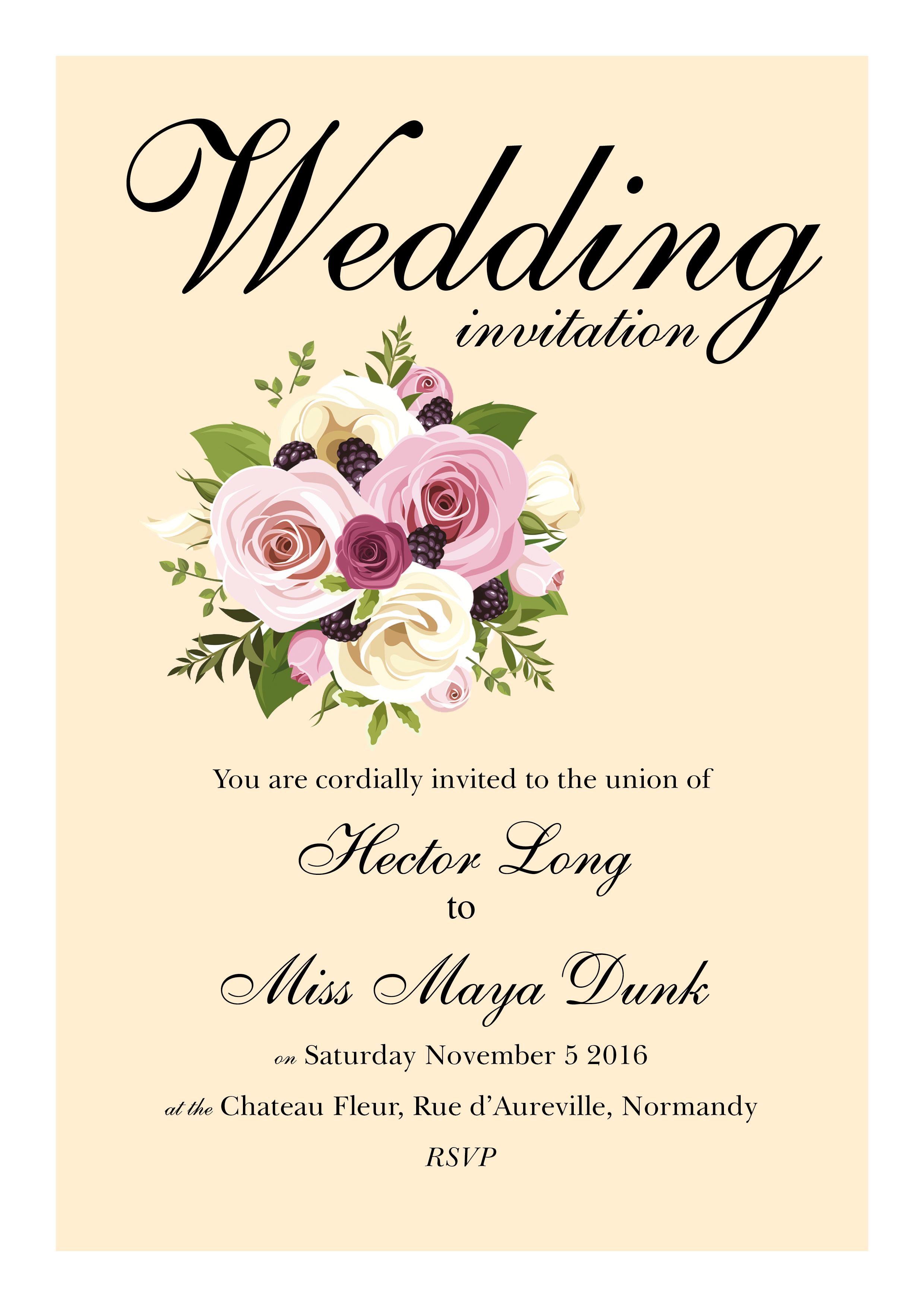
Now we will look at fonts in more detail. Say you were designing a wedding invite, we immediately think of something flowery. Here is an example:
The use of the script font is appropriate for this type of design. It lends itself to the beauty of the day. It’s delicate and enchanting. Also note that a serif font is used in the smaller text as this is also very traditional in its look and is readable as smaller text. If we used the script font all over, it would become too fussy. Just use it as an emphasis on key words.
Fonts used on a poster for a heavy metal band would look very different typeface-wise. On the poster below a decorative font has been used in the main heading and this is the sort of typeface we associate with heavy metal – it’s heavy in form, it’s quite in-your-face, intimidating perhaps, grungy and gothic. Again, the principle of not overusing this font is carried through – a sans serif font.

Another thing to consider is that your work (e.g. flyer or brochure etc) should keep to 2 or 3 typefaces at the most. Keep the typefaces exactly the same and perhaps use different weights of the same font to keep it clean, or change it a lot in terms of two completely contrasting fonts.
We want them to co-exist beautifully. Try to avoid using two or three fonts from say the “sans serif” category like Helvetica and Franklin Gothic. This can be distracting for the reader – are they the same or not? Stick to different weights of that font to create contrast and a cleaner look. Ultimately, it’s up to you which fonts you decide to use, but using the principles outlined above can improve the image and message you are trying to convey.
COLOURS
There are countless possibilities out there on the colour spectrum. We all have our favourite colours that we use on the walls of our house, or the clothes we wear, or the decorative objects we buy for our homes. These things are automatically going to influence our choices. It’s very subjective – what feeling a colour evokes in one person might have the opposite affect on another someone else. This is important to keep in mind if you are looking for a colour palette for your brand.
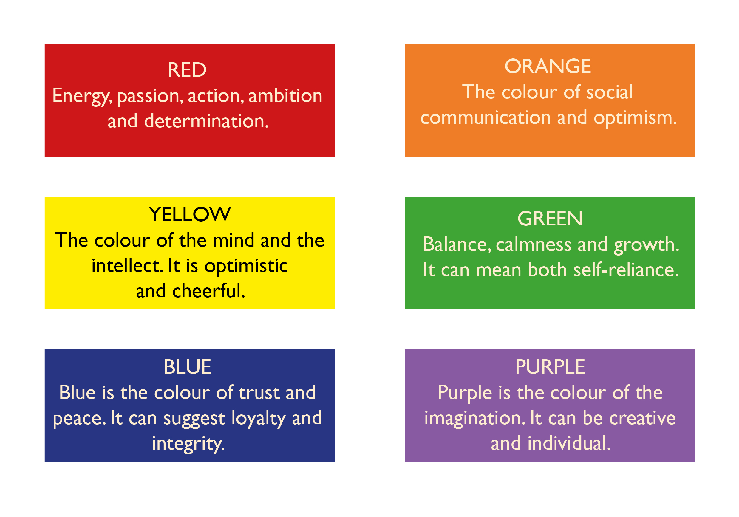
Colours a non-verbal communication system, but that doesn’t mean they don’t say anything! Below is a basic outline of some individual colours. There are obviously countless varying shades of each of these colours which in itself convey different meanings, but this will hopefully give you an idea of what different colours might be associated with in Western culture.
For a flyer that is advertising the services of a landscape gardener, you would expect to see greens – the colour of nature and other calming colours. However, cultural differences can mean colours convey different meanings in contrasting countries. Red in China is lucky. Red in the West can mean danger or passion. Red is a very emotionally intense colour, and along with orange and yellow it is a warm colour which can convey positivity.
Colours like blue, purple and green are cool colours. Blue is often associated with trust, calm and credible. There are for example a number of banks whose brand is blue – this is probably not a coincidence! The colour purple can be associated with luxury and wealth – you might have seen a luxury spa using the colour purple?
THE POWER OF FONTS AND COLOURS
Fonts and colours are more powerful than what we might initially think, and they are likely to have an (unconscious?) affect on how consumers choose which brands they will shop from or which bank they will go to. Therefore, it is vital that you consider who your audience is and who you will be trying to reach with your message. That way, your fonts and colours will be a conscious choice that is aimed at your audience rather than based on what you personally like.
I hope you found this blog post useful. We’d love to hear your thoughts on this subject so please comment below!
Leave a comment on Choosing The Right Font And Colour For Your BrandCategories BlogDid you enjoy this post? Let us know by leaving a comment below.


