We all make mistakes. It’s part of life and its a great learning process! As with everything, common design mistakes are subjective to some degree. Here, I will try and highlight a few common design mistakes that people make, and more importantly, how to avoid them.
Fonts & Text
Fonts are essential to your design but which one should you choose? Don’t make the mistake of going for every font under the sun. It creates chaos and doesn’t sit well. Again there are exceptions, but this is the rule-of-thumb. Keep to two fonts, maybe three, and to emphasise anything, use a bold or italic version of these two or three fonts. Your design will look far classier using this rule.

The Comic Sans font has gone down in history as the most despised typeface ever. Try not to use this font even if you are doing a flyer for a nursery school open day! OK, the typeface looks jokey and informal, but it will give off the wrong impression because of its notoriety and it just simply won’t do your design justice.
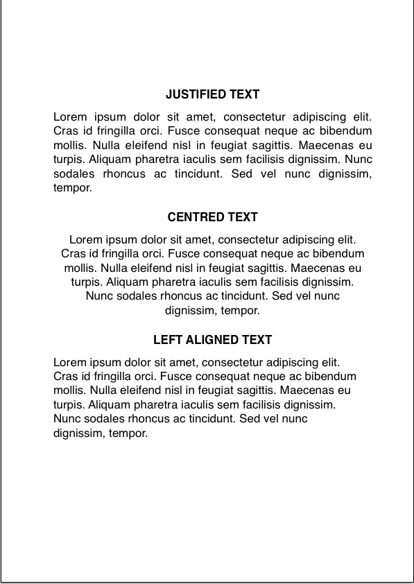
Something to be aware of once you have laid out the columns for your text is to avoid justifying the text to the column width. This can lead to problems with word spacing and widows (one word on the last line) and can make the page look clunky.

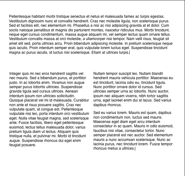
Centred text is generally just used for headings or short paragraphs. For large paragraphs of text you’re more often than not better off going with left or right aligned text. When dealing with a large amount of text, make sure you create 2-3 columns rather than having all the text in one line (see example below). This will make the text a lot easier to read!
HAVE SOMETHING IMPORTANT TO SAY? We’re often tempted to use CAPITAL LETTERS to emphasise the message we’re trying to get across, however this isn’t always the most effective way to do it. Capitals can be great for headlines or short sentences, but using upper case letters generally tends to make it look like you are “shouting”, so avoid using them on whole paragraphs of text.

Visual Elements & Colours
Visual elements are key for all design, whether you’re designing a flyer or a website. But a mistake that is often made is the lack of quality, professional-looking photos or icons. If you’re using photos, you must ensure that these are of the highest quality – blurry photos taking on a mobile will not create the effect you’re looking for. Although it’s always best to have your own photos, it might be worth investing in stock photos from websites like Big Stock Photo or Shutterstock if you don’t have the resources.
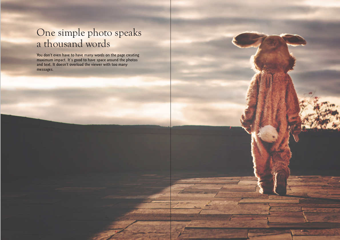
Images may be essential to your particular design. A great photograph or graphic can add real panache to your leaflet, brochure or website. Sometimes just one photo per page can be enough, even if that photo fills the page. Don’t feel obliged to use every photo taken relating to the project. One great photo can speak a thousand words. But be careful when overlaying text onto an image. It can be done, but you have to make sure the text is readable. Putting black text onto a fairly dark photo is a no-no.

It is the same with colours. Use colours that complement the other elements of your design such as logos, photos or icons, but try not to overdo it. A lack of colours could lead to a dull design, but more than 4 or 5 could end up looking cluttered. The key to an eye-catching design is to find the balance between the visuals and colours.
White Space
“White space” is a feared word amongst many. We often see that people are terrified not having enough content for their design and feel that an advert or leaflet has to have a whole dictionary contained within it. But don’t be frightened of white space, this cannot be stressed enough. White space is vital to your design as it creates a feeling of freshness and avoids overloading the viewer with information. If you use too much text, it’s hard to fit it into the constraints of the dimensions, which in turn will mean that the font has to go much smaller which may render it unreadable.
But when using white space, don’t be fooled by its name! “White space” doesn’t necessarily mean that the space is white, it just means that the space is free of text or information. The image below is a great example of use of white space. With simple, capturing copy, the designer has left the rest of the page blank – which is what makes this design work so well.
Proof Reading
Proof reading a project is an absolute must! Get someone to share in the proof reading. A fresh pair of eyes can sometimes pick up on something you have missed. A typo in any project can be the difference in getting work or the viewer avoiding you at all costs! It looks unprofessional and sloppy.
In summary, simplicity is often the answer. Use white space wisely, get a hold of high quality images, use colours that compliment the other elements of the design, and use capturing copy that has been proof-read.
Leave a comment on Common Design Mistakes (and How To Avoid Them)Categories BlogDid you enjoy this post? Let us know by leaving a comment below.


