Business cards are a great marketing opportunity. If you haven’t got one to give out to prospective clients, you will be missing out on potential business.
To save money, a lot of companies go to one of those online print companies and get a card churned out – you know the sort of thing – perhaps a bit of that infamous typeface “comic sans” and a cheeky cartoon or a bland clip art image – these are usually a disappointment in terms of the look and feel of the card and the general design, creating a not-so-professional image. And of course, others may use the same image as is on your card so it’s not unique to you. There are several business cards I have come across supplied by an online printers using the very same stylised illustration of animals for their business – one was for an animal acupuncturist and the other for a dog walking business. This is very confusing!
So, it’s important to get it right. It needs to stand out against the many competitors in your marketplace. You will be handing these cards out to people you meet and they will take a very quick look and then put it in their purse or wallet. So you have to grab their attention in a few seconds and this will ensure they remember you and your business.
The first thing worth mentioning is to make sure everything is spelt correctly and the information is spot-on. It may seem silly to mention this, but you’d be surprised what gets through. If there are any spelling errors, it will give the impression that your business is unprofessional and not up to the job.
You need to make sure that nothing wanders off the edge of the card so make sure you keep all written information 5mm from the edge. Any images used need to be of high quality – the higher the resolution, the better. Typography also needs to be legible – 7.5pt is the minimum size – but not too big though, as there is limited space on the card.
Be careful not to overcrowd it with information too. A typical business card size is: 85mm x 55mm. Even though the space is limited, you can still get creative! The only things that need to be on the card are: Name, job title, address, telephone numbers, email address and website, and of course THE LOGO! There is no need for company registration numbers. There might be some room for a strap line though (think “Every Little Helps” by Tesco or “I’m lovin’ it” by McDonald’s). A strap line should be as succinct as possible, five words or less if possible, and should convey the essence of your brand.
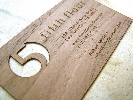
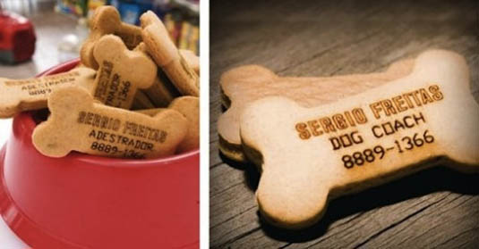
To really make the business cards stand out you can use special finishes on it to make it more tactile and memorable. Things like a spot UV (a shiny bit!) or a metallic ink or perhaps a die-cut (a funny shape cut out of the card). Of course, this makes the printing more expensive but can more than make up for that by reaping the rewards in terms of new business afterwards. Or sometimes companies go one step further and have their cards made out of materials other than card. Be as creative as your imagination or your designer’s flair allows!
Choose fonts to match your logo – either a sans serif (like Helvetica) or a serif face (like Times Roman which have flourishes at the end of the strokes). Colours must also reflect your logo with black as a good colour choice for the type information so it’s as readable as possible.
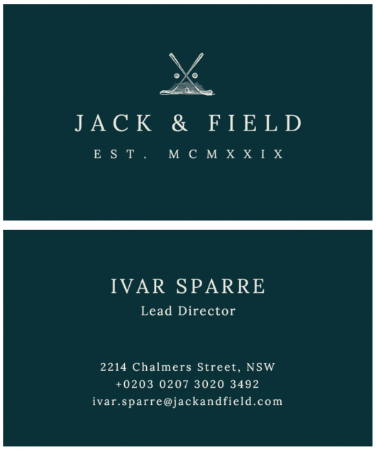
So in summary, the business cards must reflect your business and what you are trying to convey – perhaps your business was established by a family member in centuries past – you may wish to convey this with a classic design indicating a company that can be relied on, that’s classic, that is traditional, that has stood the test of time, or a new company wanting to convey structure, modernity, simplicity or freshness. Let your imagination take you to the recesses of your mind and go create!
Leave a comment on How To Make Your Business Cards Stand OutCategories Branding, Business Tips, Design, Print, Small businesses

